Rimora Studio: Brand Identity
Complete brand identity for Rimora Studio, a creative studio. Logo design, wordmark, color system, typography, business cards, and brand guidelines. A cohesive visual language across every touchpoint.
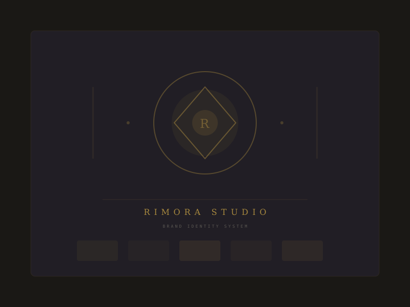
Rimora Studio
Brand Designer
6 weeks
Solo
Brand Strategy
Workshopped with the founders to define Rimora's positioning: a premium creative studio blending Cambodian heritage with modern design. Identified key brand attributes: refined, trustworthy, and quietly bold.
Logo Exploration
Sketched 30+ concepts exploring the 'Rimora' name (meaning 'ocean' in Khmer). Narrowed to a wave-geometry hybrid mark that reads as both traditional and contemporary. Refined 3 finalists across favicon, embroidery, and large-format tests.
Visual System
Built a palette of deep ocean blue, warm gold, and neutral charcoal. Paired a serif display face (Bodoni Moda) with a clean sans (Geist) for a system that feels editorial yet modern.
Brand Guidelines
Delivered a 24-page brand book covering logo usage, clear space, color ratios, typography scale, imagery direction, and application examples across print, digital, and merchandise.
Cultural Balance
The brand needed to feel authentically Cambodian without relying on cliches. Solved by abstracting traditional Khmer geometric patterns into the logo's wave form rather than literal cultural motifs.
Scalability
The identity had to work from 16px favicons to 3-meter signage. Tested the mark at 6 sizes, simplifying detail at small scales and adding refinement at large scales through a responsive logo system.
30+
Logo Concepts
24
Brand Book Pages
12
Touchpoints Designed
6
Weeks to Delivery