HRMS SaaS Dashboard
Complete UX/UI design for a multi-tenant HRMS platform with 24+ modules. From user research and wireframes to a full design system covering attendance, payroll, inventory, KPIs, and branch management.
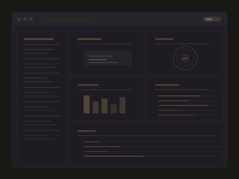
HRMS SaaS Platform
Lead UX/UI Designer
3 months
Solo design, 4 developers
Discovery & Research
Interviewed 5 HR managers across different industries to understand daily workflows. Mapped pain points in existing HR tools: cluttered dashboards, unclear data hierarchy, and inconsistent patterns across modules.
Information Architecture
Structured 24+ modules into 4 logical groups: People, Operations, Finance, and Analytics. Created a navigation system that scales without overwhelming users, with contextual shortcuts for high-frequency tasks.
Design System
Built a component library with 60+ reusable patterns: data tables, filter bars, form layouts, status badges, chart wrappers, and modal flows. Every component documented with variants, states, and usage guidelines.
Prototyping & Validation
Created interactive prototypes for the 8 most critical flows. Tested with 3 HR teams, iterating on filter UX, bulk action patterns, and mobile responsiveness before handoff.
Data Density vs. Clarity
HR dashboards pack enormous data into single views. Solved with progressive disclosure: summary cards first, drill-down tables second, and detail panels on demand. Used consistent column widths and zebra striping for scanability.
Multi-tenant Branding
Each tenant needed custom accent colors without breaking the design system. Built a CSS variable-based theming layer that swaps accent colors at the root level while keeping all structural components intact.
Mobile Responsiveness
Complex data tables don't translate to mobile. Designed a card-based alternative view for screens under 768px, with swipe-to-reveal actions and collapsible filter sheets.
24+
Modules Designed
60+
Components in System
8
User Test Sessions
5
Design Iterations