MR Jobs: Mobile App UX/UI
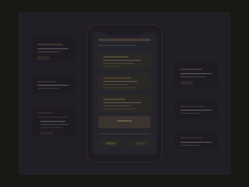
Mobile UX/UI for a job listing platform where companies post openings and candidates browse, filter, and apply. Designed for Android-first with a clean, accessible interface optimized for small screens.
MR Training and Jobs Center
UX/UI Designer
8 weeks
Solo design, 2 Flutter developers
User Research
Surveyed 40 job seekers in Phnom Penh to understand their job search habits. Key insight: most users browse jobs during commutes on 5-inch screens with intermittent connectivity. Designed for offline-first browsing.
User Flows
Mapped 6 core flows: onboarding, job browse, search and filter, job detail, application submission, and application tracking. Identified the 'apply in under 60 seconds' target as the key UX metric.
Wireframing
Created low-fidelity wireframes for 22 screens. Focused on thumb-friendly navigation, single-handed operation zones, and progressive disclosure of job details to keep the browse experience fast.
Hi-fi Design
Designed pixel-perfect screens following Material 3 guidelines with a custom accent system. Built a reusable component library in Figma with auto-layout, variants, and interactive prototypes for the apply flow.
Low Connectivity
Many users have unstable internet. Designed cached job listings, offline application drafts, and sync-on-reconnect patterns. Used skeleton loading states to maintain perceived performance.
Accessibility
Target users include first-time smartphone users. Used large touch targets (48dp minimum), high contrast ratios (7:1), clear iconography with text labels, and a simplified onboarding with progressive feature introduction.
Application Friction
Traditional job applications require CVs and cover letters that mobile users can't easily produce. Designed a profile-based apply system where users build their CV once and apply with a single tap.
22
Screens Designed
<60s
Apply Time Target
35+
Components Built
40
User Surveys