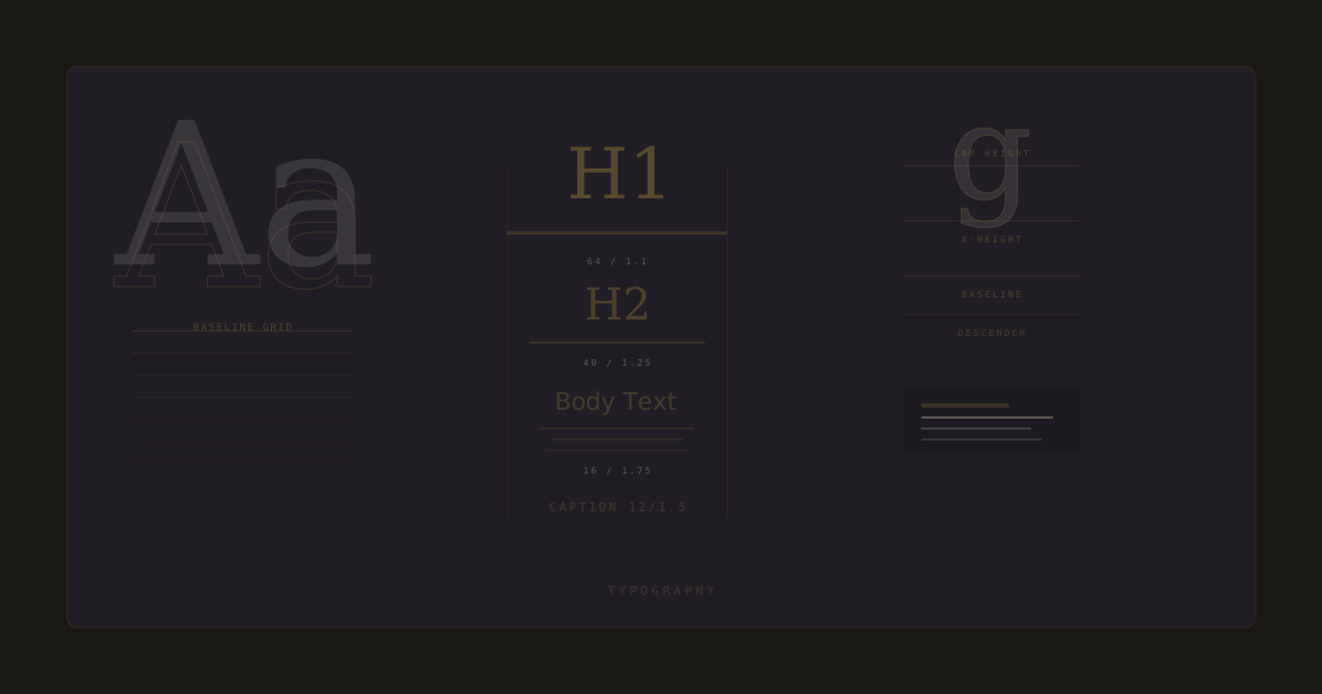
Typography in UI: Choosing Type That Works
Practical typography principles for digital products. Font pairing, hierarchy, readability, font loading performance, and Khmer script considerations.
Typography in UI is 90% of the design. Get the type right and the rest of the interface can be plain. Get the type wrong and no amount of color or motion will save it. The principles are not complicated. They are just ignored a lot.
One display, one body
Most products need two typefaces. A display face for headings and a body face for everything else. Sometimes one face in two weights is enough. Adding a third face is almost always a mistake. Every additional face is another thing the eye has to reconcile, and the payoff is rarely worth the noise.
Hierarchy is contrast, not size
A common mistake is making headings big to show they are headings. Hierarchy comes from contrast in weight, color, and spacing, not just size. A 24px heading in a heavy weight with tight tracking reads as a heading next to a 16px body in a regular weight. Size is one lever, not the only one.
- Weight: heavy headings, regular body.
- Color: high-contrast headings, softer body.
- Tracking: tighter for headings, looser for body.
- Spacing: more air above a heading than below it.
- Size: the last lever, not the first.
Readability is non-negotiable
Body text exists to be read. Anything that gets in the way of reading is wrong, no matter how good it looks. That means line length between 45 and 75 characters, line height around 1.5 for body, and contrast that meets WCAG AA at minimum. A 12px gray on a gray background is a design crime, not a design choice.
If a user has to lean in to read your body text, you have already lost. The heading is decoration. The body is the product.
Font loading is a typography decision
A beautiful typeface that takes 4 seconds to load is worse than a plain one that renders instantly. Font loading is part of typography, not an engineering afterthought. Preload critical weights, use font-display: swap to avoid invisible text, and subset fonts to the characters you actually use. I reduced font payload by 60% on a recent project by subsetting to Latin + Khmer and dropping weights the design did not use.
Khmer script changes the rules
If you build for Cambodian audiences, Khmer script support limits your typeface choices significantly. Few high-quality fonts render Khmer well across browsers and operating systems. Test every typeface against real Khmer content, not just the specimen page. Build fallback stacks that degrade gracefully: a Khmer-optimized face first, then a system fallback. Do not assume a typeface that looks great in Latin will look acceptable in Khmer.