Motion Design in UI: When Animation Helps and When It Hurts
Animation is a tool, not a decoration. The principles I use to decide when motion improves a product and when it gets in the way, with examples from my own work.
Animation in UI has a branding problem. It got associated with flashy landing pages that spin things for no reason. So a lot of teams swung the other way and removed all motion. Both are wrong. Motion is a tool for communicating state, hierarchy, and causation. Used well, it makes a product feel considered. Used badly, it makes a product feel slow. Here is how I decide.
Animate the relationship, not the object
Good motion shows the user how two things are connected. A list item expands into a detail view, and the motion carries the item's position into the detail's position, so the user knows the detail is about that item. A button morphs into a success state, and the morph tells the user the action completed. Bad motion animates the object for its own sake, a card that fades in because it can. If the motion is not communicating a relationship or a state change, remove it.
If you removed the animation and the interface still made sense, the animation was decoration. If it stopped making sense, the animation was communication.
Duration and easing are the whole craft
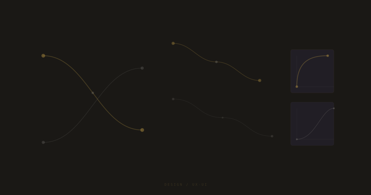
A 200ms transition with a linear easing feels cheap. The same 200ms with an ease-out-expo feels premium. The duration is not the issue, the easing is. Linear easing is almost never right for UI. Use ease-out for things entering the view, ease-in for things leaving, and ease-in-out for things moving between two states. The durations I default to are 200ms for small elements, 400ms for sections, and 600ms for full-screen transitions.
- 200ms: buttons, toggles, small state changes.
- 400ms: cards, panels, section reveals.
- 600ms: page transitions, modal open/close.
- Ease-out for entering, ease-in for leaving, ease-in-out for moving.
Respect reduced motion
A meaningful percentage of users have prefers-reduced-motion set, either because of a vestibular disorder or because motion makes them nauseous. Every animation I ship is wrapped in a check for that preference. When it is set, motion is disabled or reduced to a crossfade. This is not optional. An interface that makes a subset of users physically ill is a broken interface, no matter how good it looks for everyone else.